120 280908 - Lazy Sunday
28/09/2008
Realistically it's not often that, being a fully-fledged adult with responsibilities and bills to pay and whatnot, that you actually get a whole day to yourself. In fact, it never happens. There's always cleaning to do, or people coming round to take away your old furniture, or something that stops you doing whatever the hell you want. Every day. That's why today, I wanted to take some time out to do the stuff that I want to do (after I'd done the cleaning, and a guy came round to take away an old wardrobe - coincidence?). I wanted to:
- Re-rip some music and organise my iTunes library. Check!
- Make a playlist of albums that I hadn't had chance to check out yet and put it on my phone. Check!
- Read all my RSS feeds in one sitting. Check!
- Go for a walk around Southampton, look for and document some examples of type that I know exist. Check!
- Buy Charlotte some shoes. She's a size three - we're never able to get her shoes.
Once I managed to stop feeling bad about moving her, the music was done and we went for our walk. On Commercial Road, they've been redoing a guitar shop. It's now done and it looks badass. It totally stands out against all the other shops on the whole block. Kudos to those guys for doing something different.
Round the corner of the concrete jungle, we spotted this awesome apartment that has bright pink flowers framing their balcony and is the only one on the entire block. Stands out like a sexy thumb.
Onto type. There's no reason for this, other than the fact that I know some good compositions can emanate from great fonts, and the ones that don't breed decent compositions are just nice typefaces. You'll easily be able to spot the ones I could see something good in! Others are just font.photo.leave!
This was hilarious. I love this simple sans font, I have no idea what it is but it's tall and narrow like Helvetica. A bored waiter obviously saw me admiring their sign and enquired as to the reason for my photos. He wondered whether they were for personal use. Luckily for both of us, these aren't going towards my freelance work as a professional sign photographer. Ass.
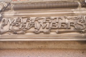
This is right next to it. Stuff like this is just so unnecessary! Such a contrast to the last one, which is just like a simple print job, some poor person has laboured over this and I really appreciate it. In a totally understated place, and serving a seemingly minimal function. A little diamond in the rough (Aladdin. Awesome).
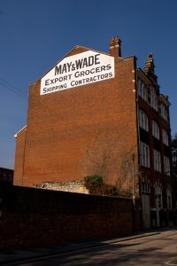
This building was pretty much my reason for even starting this. I can't really explain why, but I love this building and I love their sign.
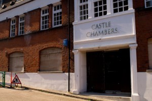
Tucked away on a side-street, this empty building bears a classic-looking, thin, simple serif font that doesn't really fit where it is. If you spin round 90˚ there's a huge, ugly, 60s block of flats.
And finally, I am always drawn to this worn 14, just down the road from our flat.
It's occurred to me that this is essentially a 60/40 split between examples of type and examples of type as a focal point for a photograph. So sue me!

